Conventions Used in Help
Innovyze help systems use several different icon types to mark books and pages within the table of contents that have special properties or convey specific information.
|
|
This is the normal icon for closed books in the help system. |
|
|
This is the standard icon for topics in the help system |
|
|
This icon means that you are being redirected to a topic somewhere else in the help system that is relevant to the current section |
|
|
This icon represents a topic that contains particularly important information |
|
|
This icon is used for books containing information about version controlled items |
|
|
Links to web pages elsewhere on the internet are marked with this icon |
Section headings are always shown in this colour.
Links to other information may mean links to other topics, additional popup information (popup link), other help files, or external websites. If you have previously followed the links they will be displayed in the same colour.
Click on the link below to see an example of text popup
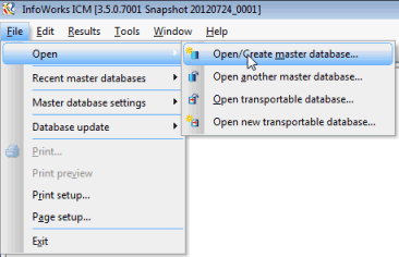
Menu items or buttons that have to be clicked in the user interface are shown like this. Menu items displayed like this - Open | Open master database - with a vertical bar between items are on a fly-out menu.
This is the usual style for a dialog title when not linked to other information.
This is a the style for a field name and the style for a field value.
This is the style for a menu item.
This is the style for a button.
Example of References
This is the style for an equation (when not in an image): a = b + c
Keys or key combinations, such as Ctrl+Enter, that you have to press on the keyboard are shown in small capitals.
Fragments of code, for example scripts for use with importers are in a special font.
Captions for images and graphs are in italics.
 Tips
Tips Tips are formatted this way.

Warnings are formatted like this. Ignore these at your peril.
Please refer to the Hidden Images and Information topic for details of typographic conventions on hidden content.


