Object Properties Window
This topic describes the different parts composing the object properties window. See Using the Object Properties Window for details on how to use this window, for example, how to customise the look and feel of the window
This window displays a network object Property Sheet when this particular network object is selected with the Properties tool ( ) on the GeoPlan window or when the
  button is selected on the Docking Windows toolbar.

In InfoWorks ICM
The Object Properties window is a modeless window providing a way of looking at all the data for a single
The Object Properties window behaves like all the other windows in InfoWorks ICM. Please refer to Windows and Using Dockable Windows for more information. In the following screenshot, the window components have been highlighted in different colours for a better visual effect. These components are described in detail in the sections below.
The Object Properties window is composed of the following parts:
Collapsed DropTree

Example of collapsed DropTree
The DropTree window caption displays the current object identifier and includes the following information:
- Object Type – the type of object (e.g., Node, Link)
- Object Sub-Type - Only applies to some object types (e.g., node = manhole, break, outfall)
- Object ID – the object primary key, value separated by a full stop when the primary key is comprised of multiple values.
- Network Name – the name of the network to which the object belongs.
The object identifier format is:
Object Type (Object Sub-Type) Object ID : Network Name
Expanded DropTree
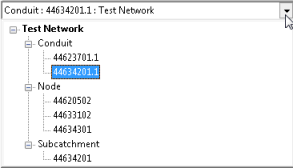
Example of expanded DropTree
To expand the DropTree, click  on the right corner of its title bar.
When the DropTree is expanded, a tree of all of open objects is displayed, grouped by Network Name, Object Type and Object ID.
Selecting an object on the tree will load the selected Object Properties Window into the visible Grid and the DropTree is closed.
An item will remain open (i.e. visible on the DropTree) until it is closed. Selecting an item and pressing the DELETE key will cause an item and all of its children to be deleted from the tree.

This toolbar allows you to perform a large variety of tasks in the Object Properties Window, such as customising / standardising layouts

The caption bar is the bar between the toolbar and the object properties. It gives a brief description of the object and contains the Close button (  ) which closes the Object Properties window for the current object.
The divider line can be used to adjust the width of the field name display (to allow long data field names to be displayed fully for example). Click and drag the divider line to the required position.
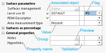
Excerpt of Properties
Properties are initially classified in system-defined groups. A user may add, delete and rename groups, and save the layout on a per user basis.
Property items are object-dependent and may contain the following parameters:
|
Property Item |
Description |
|---|---|
|
Name |
Field description which (ideally) uniquely identifies the object property and value units. |

|
The
Example of an associated object context menu The context menu may contain one or more of the following options:
|
|
Value |
Either the object property value or a visual cue indicating that a preview of the object property value is available.  Tips Tips If there is not enough space for a property value in a box, click on the |
|
Validation |
Validation errors are displayed against each property by default. A coloured icon indicates if the object property has a validation error or warning (If the cell is empty, there is no validation error or warning). Hovering over a validation icon with the mouse will display a tooltip with details about the validation error, such as the name of the network object where the anomaly occurred as well as the cause of the error/warning. See Tooltips section below for further details. It is possible to hide the validation messages on the Object Properties Window (See Object Properties Window Settings dialog for more details). |
|
Flag |
Flag associated with the current object property value. Many network object data fields can have additional information recorded using a data flag. This information may include:
Data Control and Associated Flag When editing data on an Object Properties Window, many controls will have an associated flag control immediately to their right. Select the appropriate flag from the dropdown list. For more details about using flags with your data, see Data Flags. |
Data fields, such as notes, user number and user text fields, that are common to several objects are described here.
For details of the data fields displayed on the Object Properties window for a specific network object type, refer to the Property Sheets topic.
When some areas of the Object Properties window (e.g. DropTree, property, validation error) are hovered over with the mouse, a non-editable and non-customisable tooltip with some information of the item being hovered gets displayed.
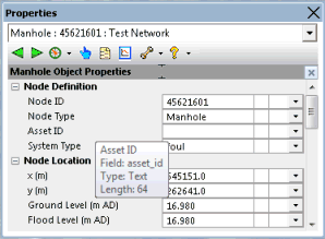
Example of property tooltip
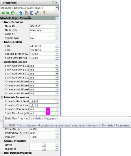
Example of validation error tooltip
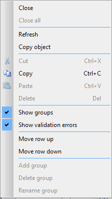
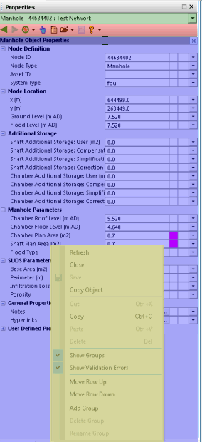
Example of Context menu
When you right-click on a group, a property, a value, an error message or a flag on the Object Properties window, a context menu like the one shown above is displayed, allowing you to perform a large variety of tasks.
Depending on which item is clicked, or which view of the Object Properties window is displayed (network object properties
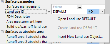
 button to display more information (i.e. notes, hyperlinks).
