Generating scatter graphs
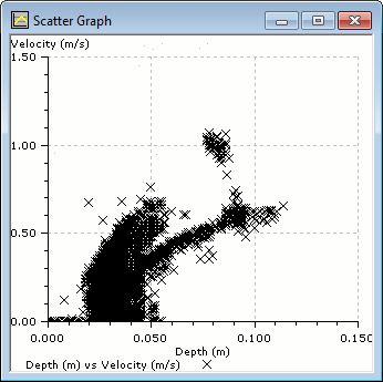
InfoWorks WS Pro lets you compare two sets of data using a scatter graph. Scatter graphs are a statistical tool that can be used to look for a correlation between two sets of data. They can also help to identify rogue values in related data sets.
Scatter graphs can be created from graphs generated using the ![]() (Graph) tool and from saved graphs.
(Graph) tool and from saved graphs.
Note: A scatter point is plotted for each time step where both variables provide a value for that time (tolerance being <0.5 seconds). A scatter plot of two result variables will always be perfectly aligned, although there may be legitimate misalignment between results and live data resulting in fewer scatter points than anticipated.
To display a scatter graph:
- Right-click the Graph view and choose Create scatter graph.
The menu item will be available only if there is more than one sub-plot on the graph.
This displays the Generate Scatter Graph dialog.
- Select a pair of variables to display on the two axes.
- If you want to display a second pair of
variables on the same graph, check the Show a second scatter plot on the same graph checkbox and then choose another pair of variables.
The second plot will be shown using an alternate colour by default.
- To add additional gridlines to the graph, check
the Horizontal lines and/or Vertical
lines checkboxes, then enter one or more values in the adjacent boxes.
Multiple values must be separated by semi-colons.
The values must be within those shown on the X and Y axes of the originating graph, otherwise they will not appear.
- To generate the scatter graph, cick OK.
Note: To change the display options for the scatter graph, right-click the graph, choose Graph properties, then make the changes in the Graph Properties dialog.

