Toolbox
The toolbox is used to build forms and may contain the following tabs:
- Default - which contains the items used to build the default form. This tab is available for every platform.
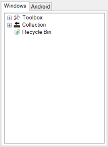
- Android - which contains the items used to build an Android version of a Default form. This tab is displayed only if an application and form platform is set to All.
Default
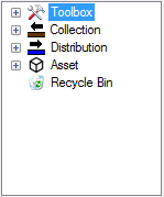
The items that may be used to build a Default form include:
- Toolbox (
 ) containing generic / default tools that can be used in the form.
 - Collection toolbox (
 )
) - Distribution toolbox (
 )
) - Asset toolbox (
 )
)
Note: The content of the Collection/ Distribution/ Asset toolboxes depends on the form status. If a new form is being created, the Collection/ Distribution/ Asset toolbox will list all the InfoAsset Manager objects available for the current network type. If an existing form is opened, only the related InfoAsset Manager object and its associated fields will be visible.
The toolbox also contains a Recycle Bin ( ). The recycle bin is initially empty but will later contain all the generic (= non-InfoAsset Manager) objects that have been removed from the form layout, making them easily re-usable in the form.
All controls/items can be added to the form by double-clicking them on the toolbox or dragging and dropping them onto the layout area of the form.
Available generic or default controls for a Default form:
Note: This toolbox is available for any form except the Android version of the Default form. The toolbox on the Android tab contains the toolbox items that can be used on an Android version of the Default form.
| Control | Icon | Description |
|---|---|---|
| Use this control to add/view specific attachment types to an Attachments object. Only one Attachments object is transferred into InfoAsset Manager for InfoAsset Manager reports. The Attachment control allows different attachments to be grouped by purpose on the form. Note: This control is not available on the Android version of InfoAsset Mobile. See Attachment properties for further information. | |
| Use this control to attach multiple files to the report. This control can be used on its own or by using image, sketch, signature and attachment objects to provide filtered access to the attachments object. Note: When creating an InfoAsset Managerform, there should only be one Attachments object per InfoAsset Manager object. Additional attachments objects can be used but these will not be transferred to InfoAsset Manager. | |
| Buttons can be added to a form and then customised. Customisation is performed via the button Property Box and/ or the Button Editor. Double-click the Button control on the form layout or click on the ellipsis button adjacent to the ButtonContents property of the button Property Box to bring up the Button Editor. Additional buttons may be added using the +/- buttons. They are then labelled and defined using the combo boxes below. Buttons can in particular be used to link forms. See Collection Network form example as an illustration. See Button properties. Note: This control is only available for use on the Home page in the Android version of InfoAsset Mobile. See Button properties for further information. | |
| Check boxes are used for Boolean fields. Once the control has been added to the form, multiple check boxes can be created and customised via the Check Box Editor. The check box title can be set using the Label section of the Property Box. See Check Box properties. | |
| Use this control to allow users in the field to either enter a defect code when filling a report, or search from it in an easy way by using a combination of dropdown lists. This control is primarily designed to facilitate the input of defect codes in CCTV and manhole survey reports. See Use of CodeLookup custom control to facilitate input of CCTV and manhole survey defect codes for more information. Note: Only drain and sewer defect codes using the WRc method are currently supported. See CodeLookup properties. | |
| Use this control to allow selection from a custom choice list. Choice list data is defined via the Combo Box Editor in the same way as check box data. Again, the title, style and other attributes can be set in from the Property Box. This control can be customised at different levels:
See Combo Box properties. | |
| Use this control for recording the date. Date format and settings are set in the Date section of the Property Box. Date controls related to Collection, Distribution or Asset network InfoAsset Manager objects are available from the Collection, Distribution or Asset toolbox respectively, under the object they are associated to. See Date properties. | |
| Use this control to divide the form into sections. The title of the divider may be set via the Label section of the Property Box. Apart from the configurable fields available in the Property Box (location, label and font size and colour), there is no user interaction with this control. See Divider properties. Notes:
| |
| Use this control to attach multiple documents to the form through a standard Windows file browser. These attached documents being related to the form and not the report, they are only downloaded to each machine once. The Documents control can be used to provide Standard Operating Procedures (SOP), manuals or reference photos to the field crews. The files attached to the Documents object can be viewed in the report, providing the relevant external viewer (e.g. Acrobat Reader) is available. See Documents properties. Tip: It is recommended to use the Attachment control or the Attachments control for display of report attachments (photos, images, sketches). | |
| FromToClock |
| Use this control to define pipe defects (where defects run from to). See FromToClock properties. |
| GPS coordinate |
| The GPS Coordinate is a live control allowing connection to an available GPS device. Configuration is performed via the GPS Button Editor. Double-click the GPS Coordinate control on the form layout or click on the ellipsis button adjacent to the ButtonContents property of the GPS coordinate Property Box to bring up the GPS Button Editor. See GPS Coordinate properties. |
| Image |
| Enables an image file to be included in the report via a standard Windows file browser. Please note that images may be reduced in size to fit the device (PDA version). See Image properties. |
| Label |
| Adds a label which may be customised via the Label section of the Property Box. There is no user interaction with this control. See Label properties. |
| List Box |
| Inserts a List Box in the form. Double-click on the List Box to display the List Box Editor, allowing you to set up the contents. See List Box properties. Note: This control is not available on the Android version of InfoAsset Mobile. See List Box properties for further information. |
| Logo |
| Allows you to display a logo image in the form. See Logo properties. |
| Numeric |
| Use this control for recording any numerical data. Note: Math operations are currently not supported. See Numeric properties. |
| Page Break |
| Inserts a page break to the form. If a form contains several pages, Back and Next buttons will appear at the bottom right hand side of the derived report, allowing users to browse through pages. See Page properties. |
| Panel |
| Inserting a new panel allows you to have a ‘mini-page’ within a page which may then be further populated with toolbox items. It is possible to make the panel collapsible by setting the Collapsible field in the Property Box to True. See Panel properties. |
| Radio Buttons |
| Adds a pair of radio buttons which may be customised via:
See Radio Button properties. |
| Related Reports |  | Provides functionality for showing a grid comprising the individual tasks within a work package report. See Related Reports properties. |
| Report Grid |
| Adds a report grid to the form. The Report Grid can contain one or more check boxes, combo boxes, date pickers, FromToClock controls, image selectors, numeric, text and time fields. Choice lists for combo boxes are defined in the Property Box (see Combo Box control, higher up in this table). The Report Grid Contents dialog gets displayed whenever a Report Grid control is added to a form. See Report Grid properties. |
| Signature |  | In conjunction with an Attachments object, provides a box into which users can write a signature. See Signature properties. |
| Provides functionality for creating a basic sketch in the field. See Sketch properties. Note: This control is not available on the Android version of InfoAsset Mobile. See Sketch properties for further information. | |
| Text |
| Use this control to record any text data (single line or multi-line). You can set default text to appear in this control when a new report is created by launching the Default Text Editor from the Text Property Box. Tips:
See Text properties. |
| Use this control for recording the time. As for other controls, customisation is made on the Property Box (e.g. Display Time). See Time properties. | |
| Use this control to capture both video and images from attached devices. The capture device is configured in the Options dialog whilst the recording format can be specified at application level or for individual forms. See VideoCapture properties. Note: This control is not required on the Android version of InfoAsset Mobile as video capture is handled by the camera on the Android device. See VideoCapture properties for further information. |
As can be seen from the table above, some controls can be customised via related editors which are launched either by double-clicking the controls on the form layout or by clicking the ellipsis button adjacent to the controls on the Property Box. Please refer to the individual links present in the table for details on each of these editors.
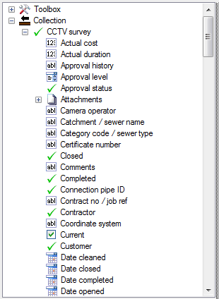
Items within the Collection Toolbox relate specifically to InfoAsset Manager Collection system tables and are added to a form in exactly the same way as previous toolbox items. Some fields are required (shown in red in the toolbox) relating to Primary key fields in InfoAsset Manager and therefore must be included on a form for the form to be saved.
For example, the CCTV survey object has one mandatory field, ID. This item is shown in red in the toolbox tree view and validation checks it is present when the form is saved; if it is not, an error dialog will be displayed (see the Distribution Toolbox section below for an example of dialog).
User fields (user text, user number and user date fields) are also available for selection, for each InfoAsset Manager object. These fields are network-dependent and can be found in the extended subsection of the tree view.
Items within the Distribution Toolbox relate specifically to InfoAsset Manager Distribution system tables and are included in a form in exactly the same way as with previous toolbox items. As with the Collection Toolbox there are some fields which are required (in red). They relate to Primary key fields in InfoAsset Manager and as such, must be included on a form before saving time.
For example, the Burst Incident object has one required field, Incident ID. Validation checks required items are present when the form is saved and if it is not the case, a warning message will be displayed. ![]() Show message
Show message
User fields (user text, user number and user date fields) are also available for selection, for each InfoAsset Manager object. These fields are network-dependent and can be found in the extended subsection of the tree view.
Items within the Asset Toolbox relate specifically to InfoAsset Manager Asset system tables and are included in a form in exactly the same way as with previous toolbox items. As with the Collection or Distribution Toolboxes there are some fields which are required (in red). They relate to Primary key fields in InfoAsset Manager and as such, must be included on a form before saving time.
For example, the Work Package object has one mandatory field, ID. This item is shown in red in the toolbox tree view and validation checks it is present when the form is saved; if it is not, an error dialog will be displayed (see the Distribution Toolbox section below for an example of dialog).
User fields (user text, user number and user date fields) are also available for selection, for each InfoAsset Manager object. These fields are network-dependent and can be found in the extended subsection of the tree view.
The recycle bin is used to keep any non InfoAsset Manager toolbox object that is removed from the layout of published forms. These deleted generic objects are saved and published with the form design. This means that all the information related to them (properties in general such as links, labels and formatting) is retained and that they can be re-added to the form at a later date, just by a simple drag and drop or double-click.
Note: When objects/ controls are deleted from unpublished forms, they will not appear in the recycle bin. Only objects deleted from published forms will be sent to the recycle bin and therefore can be used with the same properties and formatting at a later date.
It is possible to empty the recycle bin by right-clicking the recycle bin object in the toolbox and selecting Empty recycle bin.
A warning will be displayed if non-InfoAsset Manager objects are located in the recycle bin. Show message
The user is given three options:
- All - Delete both InfoAsset Manager and non-InfoAsset Manager objects from the recycle bin.
- InfoAsset ManagerOnly - Delete InfoAsset Manager objects only from the recycle bin.
- Cancel - Cancel the emptying of the recycle bin.
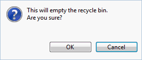
If there are only InfoAsset Manager objects in the recycle bin, the user will be asked for confirmation. Show message
Click OK to proceed with the deletion.
Android
The items in the toolbox on the Android tab are used to build an Android version of the Default form, and include:
- Toolbox (
 ) contains generic / default tools that can be used in the Android version of the Default form.
 - Windows Form Toolbox (
 ) contains any items from a Collection, Distribution or Asset toolbox that are used in the Default form.
- Label
- Page break
- Panel
These items are described in the Toolbox table in the Default section, and are added to a form in exactly the same way as the toolbox items displayed in the Default tab. See Creating Forms for further information.
Contains any items from a Collection, Distribution or Asset toolbox that are used in the Default form. These items can be added to the Android form in exactly the same way as previous toolbox items. It allows you, for example, to exclude items in the Windows form that have dynamic data set for them which may not be required to be downloaded to an Android device.
Any control on the Android form can be updated with the current data in the Default form by selecting the Update properties from Windows form option from the control's context menu.
The Default Form toolbox is only available on the Android tab which is displayed when the form Platform property is set to All.
The Android form can be deleted by right-clicking on the toolbox pane and selecting Delete Android form from the context menu.
Further Customisation via a context menu
Further settings can be defined through a control's context menu (right-click on an item on the form) and yet more settings available through right-clicking on a blank area of the form or between rows and columns. Most of these will be self-explanatory e.g. insert page, delete column etc. Some of the controls in the Property Box pane may not be so obvious and are detailed in the Property Box topic.


